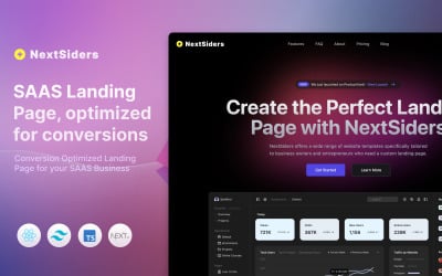
You know that feeling when you're scrolling through a website, and suddenly, boom! A page pops up that just gets you? It speaks your language, offers exactly what you need, and makes signing up or buying something feel like the easiest decision ever. Well, my friend, that's the magic of a high-converting landing page, especially if you're in the wild world of SaaS marketing.
Think about it: you've spent good money and countless hours driving traffic to your site. You've got folks clicking on your ads, sharing your content, and maybe even humming your jingle (if you have one!). But if they land on a page that's confusing, uninspired, or just plain boring, all that effort goes poof! into thin air. That's where killer landing page templates come in. They’re like your secret weapon, designed to turn curious visitors into loyal customers, faster than you can say "free trial!"
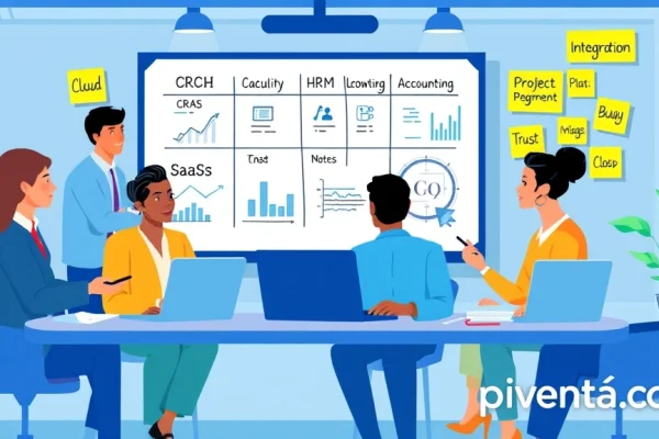
Why Your SaaS Business Needs High-Converting Landing Page Templates
Let's be real, in the competitive landscape of SaaS, everyone's vying for attention. You're not just selling software; you're selling solutions, dreams, and a better way of doing things. And a high-converting landing page is your virtual salesperson, working 24/7. It's not just about looking pretty; it’s about guiding your visitors, step by logical step, towards that coveted conversion.
The Power of Focus
Unlike your main website, which might have a gazillion links and distractions, a landing page is a laser beam. It has one goal, and one goal only: to get your visitor to take a specific action. No sidebar menus, no unrelated blog posts, just pure, unadulterated focus. This clarity drastically improves your conversion rates.
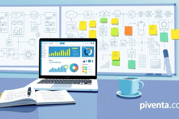
A/B Testing Made Easy
Ever wonder if a green button performs better than a blue one? Or if a short form beats a long one? With templates, you can easily create variations and test them against each other. This isn't just guesswork; it's data-driven optimization, helping you fine-tune your pages for maximum impact. It's like having a scientific lab for your marketing!
Speed and Efficiency
Building a landing page from scratch can feel like building a rocket ship – complex and time-consuming. Templates are your pre-flight checklist. They come with pre-designed layouts, sections, and even placeholder text, so you can launch new campaigns in a flash. This means more time focusing on strategy and less time wrestling with design elements.
Key Elements of a High-Converting SaaS Landing Page Template
So, what makes a template truly "high-converting"? It's not just about drag-and-drop functionality; it's about incorporating psychological triggers and best practices that nudge visitors towards conversion.
Compelling Headline and Subheadline
This is your first impression, your elevator pitch. It needs to grab attention, clearly state your value proposition, and make the visitor curious enough to keep reading. Think benefits, not just features. For example, instead of "Our CRM Software," try "Boost Your Sales by 30% with Our Intuitive CRM!"
Clear and Concise Value Proposition
Why should they care? What problem do you solve? Your landing page needs to answer these questions immediately. Use bullet points or short paragraphs to highlight the core benefits. Remember, people don't buy features; they buy solutions to their problems.
Engaging Visuals
SaaS can sometimes feel a bit abstract. High-quality images, videos, or even interactive demos can bring your product to life. Show, don't just tell. A short explainer video can often convey more information and evoke more emotion than a thousand words.

Strong Call-to-Action (CTA)
This is the moment of truth. Your CTA needs to be prominent, action-oriented, and irresistible. Instead of a generic "Submit," try "Start Your Free Trial Now," "Get My Personalized Demo," or "Unlock My Productivity." Make it clear what happens after they click.
Social Proof and Testimonials
People trust other people. Including testimonials, case studies, client logos, or even review snippets builds credibility and reduces perceived risk. If a well-known company in your industry uses your product, flaunt it!
Minimalist Design and User-Friendly Layout
Clutter is the enemy of conversion. A clean, uncluttered design helps visitors focus on the important stuff. Use plenty of white space, clear fonts, and a logical flow of information. Nobody wants to feel overwhelmed when they land on a page.
Top High-Converting Landing Page Template Categories for SaaS Marketing
Different goals call for different page structures. Let's explore some popular template types that consistently deliver results for SaaS companies.
Lead Generation Templates
These are designed to capture contact information, often in exchange for a valuable resource like an e-book, whitepaper, webinar registration, or a free tool.
| Element | Description | Example CTA |
|---|---|---|
| Headline | Problem/Solution focused | "Download Your Free Guide to SaaS Growth" |
| Offer | Clear description of the valuable resource | "Get Instant Access" |
| Form | Short and to the point (Name, Email, Company) | "Download Now" |
| Social Proof | Number of downloads, testimonials about the resource | "Get the Guide" |
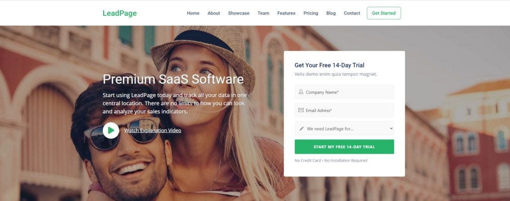
Free Trial Sign-Up Templates
The goal here is to get users to try your product with minimal friction. These pages emphasize ease of use and immediate value.
| Element | Description | Example CTA |
|---|---|---|
| Headline | Benefit-driven, emphasizes ease of getting started | "Start Your 14-Day Free Trial – No Credit Card Required!" |
| Key Benefits | Bullet points highlighting what they'll gain during the trial | "Try It Free" |
| Short Form | Usually just email and password | "Start My Free Trial" |
| Trust Badges | Security seals, "no credit card required" | "Sign Up Today" |
Demo Request Templates
For more complex SaaS solutions, a personalized demo can be crucial. These pages aim to schedule that one-on-one interaction.
| Element | Description | Example CTA |
|---|---|---|
| Headline | Focus on personalized solution and problem-solving | "See How [Your Product] Can Transform Your Business" |
| Benefits | What they'll learn during the demo, tailored to their needs | "Request a Demo" |
| Form | More detailed (Company Size, Role, Specific Pain Points) | "Schedule Your Demo" |
| Team Photos | Show the friendly faces they'll be talking to | "Book My Demo" |
Webinar Registration Templates
If you're hosting a webinar to educate and attract leads, these templates are your go-to.
| Element | Description | Example CTA |
|---|---|---|
| Headline | Exciting and benefit-oriented | "Master [Topic] in Our Exclusive Webinar!" |
| Speaker Info | Establish credibility of the presenter | "Register Now" |
| Agenda/Topics | What attendees will learn and gain | "Save My Spot" |
| Date & Time | Clear and prominent | "Sign Up for Free" |
Customizing Your Template for Maximum Impact
A template is a fantastic starting point, but it's not a one-size-fits-all solution. To truly make it sing, you need to infuse it with your brand's unique personality and tailor it to your specific campaign.
Brand Consistency
Your landing page should feel like a natural extension of your website and other marketing materials. Use your brand colors, fonts, and tone of voice. This builds trust and reinforces your identity.
A/B Test Everything!
I can't stress this enough. Don't just set it and forget it. Test different headlines, CTAs, images, form lengths, and even the placement of elements. Small tweaks can lead to significant gains. Tools like Google Optimize or dedicated landing page platforms make this easy.
Mobile Responsiveness is Non-Negotiable
A huge chunk of your audience is likely viewing your pages on their phones. Ensure your chosen template looks fantastic and functions flawlessly on all devices. A clunky mobile experience is a guaranteed conversion killer.

Speed Matters
In today's fast-paced world, if your page takes more than a few seconds to load, people are gone. Optimize your images, minify your code, and use a reliable hosting provider. Every millisecond counts.
FAQ: Your Burning Questions Answered!
You've got questions, and I've got answers. Let's dive into some common queries about high-converting landing page templates.
Q1: What's the biggest mistake SaaS companies make with their landing pages?
A1: Oh, that's an easy one! The biggest mistake is trying to do too much. A landing page should have one clear goal. When you cram too many offers, links, or messages onto a single page, you confuse visitors and dilute your conversion efforts. Keep it simple, focused, and direct. Think of it as a laser, not a shotgun!
Q2: Do I really need to A/B test everything? Isn't it just guesswork?
A2: Absolutely not guesswork! A/B testing is like having a scientific experiment for your marketing. You're not just guessing; you're gathering real data on what resonates with your audience. Even small changes, like the color of a button or the wording of a headline, can have a surprisingly big impact on your conversion rates. It's how you truly optimize and get the most bang for your buck.
Q3: How long should my landing page copy be?
A3: It depends on the complexity of your offer and the stage of your funnel. For a free e-book download, short and sweet is usually best – just enough to convey the value. For a high-ticket SaaS product that requires more education, a longer page with more detailed explanations, case studies, and FAQs might be necessary. The key is to provide enough information to overcome objections without overwhelming the visitor. Think "just right," like Goldilocks.
Q4: What's the ideal number of form fields on a landing page?
A4: Generally, fewer is better! Every additional form field acts as a barrier. For top-of-funnel offers like e-books, aiming for 1-3 fields (like name and email) is ideal. For demo requests or more serious inquiries, you might need a few more fields to qualify leads, but always ask yourself: "Is this field absolutely essential right now?" If not, ditch it!
Q5: Can I use my website's homepage as a landing page?
A5: Not really, and here's why: your homepage serves a different purpose. It's a general hub with navigation, links to various parts of your site, and a broader overview of your company. A landing page, however, is hyper-focused on a single conversion goal. It removes all distractions and guides the visitor towards one specific action. Using a homepage as a landing page is like trying to use a Swiss Army knife when you really need a precision scalpel.
Q6: What's the most important visual element for a SaaS landing page?
A6: While great design is crucial, the most impactful visual element is often a high-quality product screenshot or a short explainer video. SaaS can sometimes feel abstract, so showing your product in action, highlighting its user-friendly interface, or demonstrating a key feature can quickly convey value and build excitement. It helps people visualize themselves using your solution.
Q7: How often should I update my landing page templates?
A7: It's not about constantly changing the template itself, but rather continuously optimizing the content within it. You should regularly review your landing page performance, analyze your A/B test results, and update your copy, visuals, and CTAs based on what's working (or not working!). As your product evolves or your marketing goals shift, you might need to adjust your template or create new ones, but the template itself is more of a foundational asset. Aim for continuous improvement, not just sporadic overhauls.
Time to Launch Your High-Converting Landing Pages!
So there you have it, folks! High-converting landing page templates aren't just a nice-to-have; they're a must-have for any SaaS marketing company looking to scale and succeed in the US market. They save you time, help you focus, and most importantly, turn those curious clicks into valuable conversions.
Don't let your marketing efforts fall flat at the finish line. Grab a fantastic template, customize it with your unique brand magic, and start A/B testing your way to marketing glory. What's one change you're excited to make to your landing pages today? Share your thoughts below, and let's get those conversions soaring!