In a crowded market, candle brands must stand out to catch buyers’ attention. Good design plays a huge role in how products appear on shelves. Many factors work together to create packaging that attracts shoppers and increases sales. Let’s explore the key areas to consider when designing packaging that truly shines.
Understanding Your Target Audience’s Tastes
To design packaging that grabs attention, you must know your audience. People buy candles for different reasons. Some love them for cozy moments, while others gift them for special events. Knowing what appeals to your customers helps you choose designs they will love.
Consider age, gender, lifestyle, and shopping habits. For example, younger buyers might prefer bold colors and modern fonts. Older customers may lean toward classic styles and softer shades. Trends also affect taste. Many shoppers now want products that look natural and eco-friendly.
Conduct surveys or use social media to gather insights. Ask your customers about colors, patterns, and materials they prefer. Retailers can also share what packaging styles sell well in stores.
Besides style, think about emotional impact. Colors and shapes can trigger feelings. Warm colors feel inviting. Cool colors bring calmness. Shapes also matter. Clean lines look modern. Rounded edges seem softer and more luxurious.
Understanding your audience helps avoid designs that miss the mark. If your candle boxes do not connect, people might choose a rival brand instead. Research prevents wasted money on designs that don’t sell.
Selecting Colors That Spark Interest
Color choices can make or break your shelf impact. Shoppers often judge products in seconds. Bright, appealing colors can pull people toward your product. Dull shades might leave your items unnoticed.
When picking colors, think about the feelings you want your candles to inspire. Soft pastel colors give a relaxing vibe. Rich jewel tones suggest luxury. Neutral colors appeal to those who prefer simplicity.
Color also helps with brand recognition. People remember brands by their colors. Think about famous companies whose colors you recognize instantly. You want customers to see your packaging and know it’s yours.
Another important factor is how colors look under store lights. Sometimes, lights in stores change how colors appear. Always test your color samples in different lighting to ensure they stay attractive.
For seasonal collections, use colors linked with specific times of the year. For example, warm golds and reds work well for holidays. Fresh greens and yellows suit spring launches.
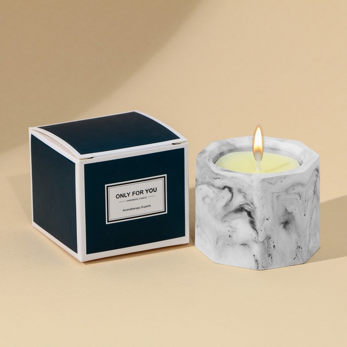
Choosing Shapes and Structures That Stand Out
The shape and structure of packaging influence how people view your brand. Creative designs help your products stand apart from others. Standard box shapes work well, but unique forms catch more eyes.
You might choose square boxes, cylinders, or custom shapes that echo candle themes. For example, a box shaped like a flame could spark curiosity. However, always balance creativity with practicality. Unusual shapes may be tricky to stack on shelves.
Sturdiness matters too. Your packaging must protect the candle during transport and display. Thin materials may bend or crush, hurting how your product looks. Strong cardboard or sustainable rigid board adds durability without making the box bulky.
Consider how easy it is to open the box. People like packaging that’s simple to handle. Complicated closures frustrate buyers. A smooth, satisfying unboxing experience also builds brand loyalty.
Transparent windows are popular. They let customers see the candle’s color and texture without opening the box. This visual cue can persuade them to pick your product over a rival’s.
Using Eco-Friendly Materials to Appeal to Conscious Consumers
Today’s shoppers care about the environment more than ever. Many look for brands that use eco-friendly packaging. This trend is not just good for the planet. It also improves how people see your products.
Eco-friendly materials come in many forms:
- Recycled cardboard is popular and strong enough to protect candles.
- Kraft paper offers a natural look many buyers love.
- Plant-based inks reduce harm to the environment.
Using eco-friendly materials can give your brand an edge. Buyers feel good supporting products that match their values. It can also help you reach stores with strict sustainability rules.
However, eco-friendly choices must still look attractive. People want packaging that’s both green and beautiful. Designers often use clever printing techniques to keep boxes stylish while staying eco-friendly.
Also, highlight your eco-friendly efforts on your packaging. Small symbols or phrases, like “100% recycled” or “biodegradable,” help customers spot your sustainable choices. Transparency builds trust.
Crafting Typography That Draws Attention
Typography plays a key role in how people view your product. The right fonts can make your packaging look classy, fun, or luxurious. Poor typography, on the other hand, can make even great designs look cheap.
Start by choosing fonts that fit your brand. A modern brand might use clean, simple lettering. A classic brand might choose elegant script fonts. Make sure the text is easy to read. Shoppers often scan shelves quickly. If they can’t read your packaging fast, they may move on.
Font size is important too. Headlines should be big enough to stand out. Smaller text should still be readable. Good spacing between letters and lines also makes text clearer.
Typography should work well with other design elements. If you have bold colors or busy patterns, simpler fonts keep the design balanced. If your packaging is minimal, a striking font can become the star of your design.
Another way to make text pop is through finishes. Foil stamping or embossing makes letters shine and adds a touch of luxury. However, use these sparingly so they don’t overpower the rest of the design.
Incorporating Visual Storytelling Through Imagery
Images on packaging do more than decorate. They tell a story about your brand. A beautiful picture can stir emotions, suggest scents, or highlight the candle’s purpose.
Use photos or illustrations that match your brand’s vibe. For a luxury candle, you might use elegant lifestyle images. For a rustic candle, nature scenes work well. High-quality images are key. Blurry or cheap-looking pictures can harm your brand’s image.
Visuals can also explain your product’s benefits without words. For example:
- A picture of a candle lit during a cozy dinner suggests warmth and comfort.
- Nature-inspired images hint at fresh, clean scents.
- Pictures of spa settings suggest relaxation.
Keep your imagery consistent. If your brand uses earthy tones and simple designs, don’t add bright, flashy photos. Everything on the packaging should feel connected.
Don’t forget cultural meanings. Some images might be fine in one country but offensive in another. Always research your target market to avoid costly mistakes.
Enhancing Shelf Presence with Finishing Touches
Special finishing techniques can take your packaging from nice to outstanding. These final touches often catch the light or add texture that shoppers can feel.
Consider techniques such as:
- Embossing, which raises parts of the design for a 3D effect.
- Foil stamping, adding shiny metallic details.
- Spot UV, creating glossy areas against matte backgrounds.
- Soft-touch coatings for a velvety feel.
These finishes attract shoppers because they suggest quality and luxury. People often pick up boxes with unique textures, leading them to examine your product closer.
However, don’t overdo these effects. Too many finishes can make packaging look cluttered. Choose one or two techniques that match your brand style.
Think about cost as well. Special finishes often add to production expenses. Plan your budget wisely to ensure these touches fit within your price range.
Finishes should also work well with practical needs. For example, soft-touch coatings must still resist fingerprints or dirt. Always test samples before full production.
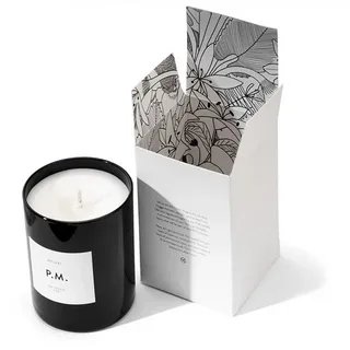
Creating Memorable Unboxing Experiences
The experience of opening packaging is as important as how it looks on the shelf. A memorable unboxing journey leaves customers feeling delighted and valued. People share these experiences on social media, spreading word of mouth for your brand.
Think about how the box opens. A magnetic closure feels luxurious. A ribbon adds elegance. Even simple details like tissue paper or printed messages inside the box add surprise and joy.
The inside design should look as good as the outside. Use brand colors or subtle patterns. Include small notes thanking customers for their purchase. These details create a stronger bond with buyers.
Unboxing should also be smooth. Avoid complicated structures that frustrate customers. Ensure protective inserts keep candles safe while looking stylish.
People often reuse beautiful packaging. This extends your brand’s visibility. If your box is strong and attractive, customers might keep it for storage or decoration.
An impressive unboxing experience turns one-time buyers into loyal fans. It makes customers feel special and shows that you care about every detail of their journey with your brand.
Conclusion
Designing packaging that stands out takes careful planning and creativity. Every choice, from colors to shapes, plays a role in drawing shoppers toward your candles. Understanding your audience, using strong visuals, and adding special touches help you create packaging that shines on crowded shelves. When done well, these efforts turn simple products into irresistible treasures. Investing in thoughtful design ensures your brand not only gets noticed but stays remembered, building trust and loyalty among customers for the long term.