In residential interior design, one of the most important decisions homeowners face is how to match flooring and wall colours. This choice affects the mood, flow, and style of every room. Whether you aim for harmony or bold contrast, the right combination can enhance comfort and beauty.
A well-matched palette creates unity. Poor choices can make spaces feel off-balance or uncomfortable. In cities like Singapore, where space is limited and style matters, getting the balance right becomes essential. A skilled residential architect Singapore often works closely with homeowners to guide them through this colour-matching process. This article explores how you can make thoughtful, confident choices about colour and material.
Understanding the Basics of Colour in Interior Design
Before matching, you must understand the nature of colour. Colours affect how we feel. They guide how we use space. Some tones add warmth. Others cool a room. Matching floor and wall colours involves more than picking shades you like. It’s about setting the tone for how you live.
1. Warm vs Cool Colours
- Warm colours like beige, gold, and red bring energy and closeness. Cool colours like grey, blue, and green create a calm and spacious environment. Your floor and wall combination should reflect how you want to use each room.
2. Light vs Dark Shades
- Light walls and floors often open up small spaces. They reflect light and make rooms feel larger. Darker tones add weight and luxury. They suit larger rooms or areas where you want a cosy feeling.
3. Colour Families and Undertones
- Stick to colours from the same family or with similar undertones. This keeps things unified. For example, a grey floor with warm undertones suits cream or taupe walls more than cold blue ones.
Common Floor Types and Their Colour Traits
The type of flooring you choose often guides your wall colour options. Let’s look at common materials:
1. Wood or Wood-Look Flooring
- Wood floors vary by grain, tone, and polish. Oak, maple, and walnut all carry different undertones. Lighter woods suit soft pastels or muted whites. Dark woods stand strong against pale grey or olive walls.
2. Stone and Tile
- Tiles offer a wide range of finishes. Marble adds elegance and suits light walls. Terracotta brings warmth and matches rustic whites or sandy neutrals.
3. Vinyl and Laminate
- Modern vinyl mimics real wood or tile but gives more colour freedom. Because it reflects less light, it works well with bright or mid-tone walls.
How Residential Architects Approach Colour Pairing
A skilled residential architect Singapore studies space, light, and layout before suggesting a palette. Their choices consider how colour reflects in daylight, how rooms connect, and how materials age.
They often use:
- Colour wheels to match complementary or analogous tones
- Test patches to observe how colours shift with sunlight
- Floor samples to compare directly against the wall paint
Working with an architect gives homeowners confidence. Yet, with the right tools, you can make strong choices even without one.
Principles for Matching Flooring and Wall Colours
Let’s break down a few solid approaches used in flooring and wall colour residential interior design Singapore homes.
1. Start with the Floor
- Your floor usually covers the largest surface after the walls. Begin with its colour and pattern. Once chosen, find a wall tone that either blends or contrasts.
2. Use Contrast to Define Space
- Use light and dark tones to separate open areas. For example, light wood floors with charcoal walls define a dramatic living room. In contrast, white walls with deep brown floors calm the mood in bedrooms.
3. Aim for Tone Harmony
- Match warm with warm and cool with cool. This rule brings unity. You can mix materials, but their temperature should align.
4. Mind the Lighting
- Natural light changes how colours look. North-facing rooms need warm walls to balance shadows. Bright spaces support cooler colours. Always test colours in your room’s actual light.
Mistakes to Avoid
Avoid common pitfalls by thinking beyond colour swatches.
1. Clashing Undertones
- Even two greys can clash if one leans blue and the other yellow. Always compare samples under the same light.
2. Overmatching
- Matching the wall and floor too closely may flatten the space. Contrast adds depth. Use rugs, trim, or furniture to soften or frame the transitions.
3. Ignoring Function
- Consider how the room works. Mudrooms or kitchens require practical floors. Pair with durable paint in washable finishes.
Design Strategies for Specific Rooms
1. Living Room
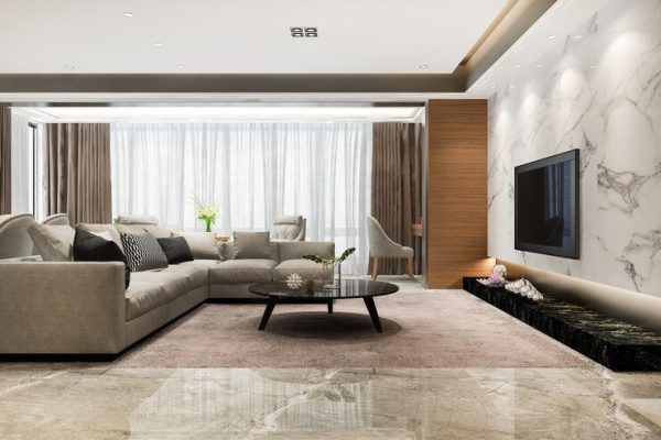
- Go for balance. If you choose bold floor tones, keep walls neutral. Pale oak floors work well with sage or beige walls. Medium grey floors suit soft cream or cool stone wall colours.
2. Kitchen
- Keep it fresh. White walls pair with medium-tone wood or tile floors. If you like colour, use soft pastels that don’t compete with cabinets.
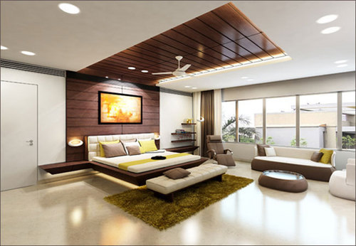
3. Bedroom
- Create peace. Use warm wood or plush carpet with soft tones on the wall—blush, dusty blue, or ivory often work.
4. Bathroom
- Stone, tile, or vinyl suits wet spaces. Stick to clean contrast—white walls and grey floors, or vice versa.
Using the 60-30-10 Rule
Interior designers often use this colour distribution rule:
- 60% dominant colour (often the wall)
- 30% secondary (floor or large furniture)
- 10% accent (decor)
Apply this rule to avoid overload or dullness. If your floor is bold, tone down the wall, and add accents through art or fabric.
When to Go Monochrome
Monochrome doesn’t mean boring. A full room in layers of cream, stone, or grey creates luxury and calm. Use textures—wood grain, tile gloss, matte paint—to add interest.
This works especially well in flooring and wall colour residential interior design Singapore flats, where open layouts benefit from visual flow.
Sample Combinations for Different Styles
Here’s a quick reference for popular design styles and their suggested flooring and wall pairings:
|
Design Style |
Floor Type & Colour |
Suggested Wall Colour |
|
Scandinavian |
Light oak wood |
Soft grey or white |
|
Modern Minimalist |
Polished concrete |
White or cool taupe |
|
Industrial |
Dark wood or tile |
Charcoal or brick red |
|
Coastal |
Whitewashed wood |
Sky blue or sandy beige |
|
Classic |
Medium wood |
Cream or soft olive |
Use this guide to pair tones confidently with your design vision.
Final Thoughts
Matching floor and wall colours shapes the soul of your space. Every tone you choose affects how your home feels and works. When done thoughtfully, colour combinations add beauty, function, and calm to every room.
In residential interior design, balance matters more than boldness. Start with your floor. Observe your light. Use natural tones. Then, test your combinations before you commit.
If needed, consult a trusted residential architect Singapore homeowners recommend. They bring insight not just in design, but in how materials live, fade, and age over time.